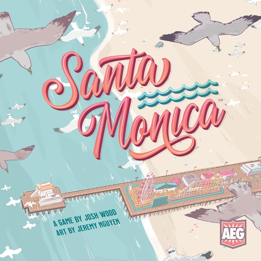
Places like Santa Monica always conjure up images in my head. Scenes from ’80s films of women with big hair roller-skating along endless, sun-drenched sidewalks, people in Ray-Bans playing beach volleyball in the background, muscle beaches etc. Santa Monica is a game where you’re trying to develop such a neighbourhood in South California, and trying to choose the features which will score you the most points.
We can live beside the ocean
With each turn you’ll draft feature cards from the central display, and then add them to either the beach, or street side of your little spot beside the ocean. Locals, tourists, and even VIPs will be taking in the sights, and moving around your growing hot-spot. When enough cards are added to one person’s neighbourhood, you count up the scores from your cards and your visitors’ positions, and see who triumphs.
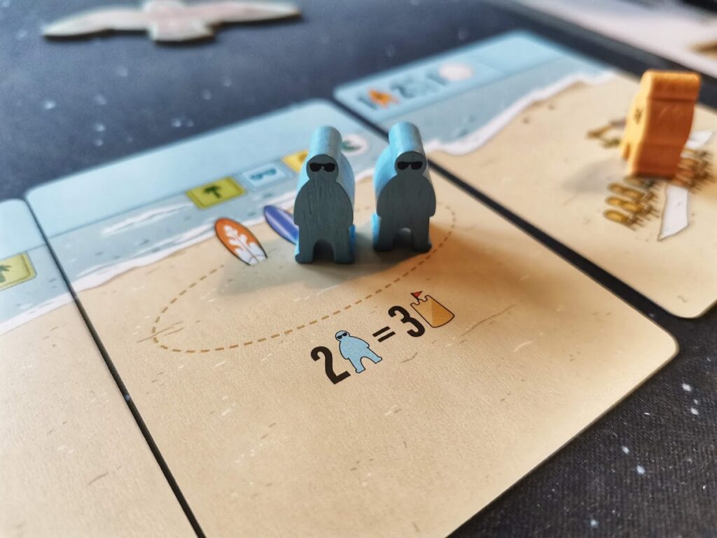
The gameplay loop of Santa Monica is really simple. Draw a card and place it adjacent to another in your area. Each card might have its own features, like a beach volleyball court for example, which are places you want certain people to end up in at the end of the game. The cards will also tell you what to do, such as add more tourists and move two, for example. Alternatively, you can spend the sand dollars you collect – the game’s currency – and take special sand dollar actions. These actions vary at random during the game setup.
Leave the fire behind
The skill comes in deciding exactly where you move your colourful little meeples, and which cards you place your new card next to. There are scoring opportunities everywhere, not just for the places the meeples end up in, but also which type of cards are adjacent to others, chains of identical card types, and your own individual scoring goals. When you put it all together, it creates a game which is far trickier than the laid-back aesthetic and gorgeous, pastel artwork would have you believe.
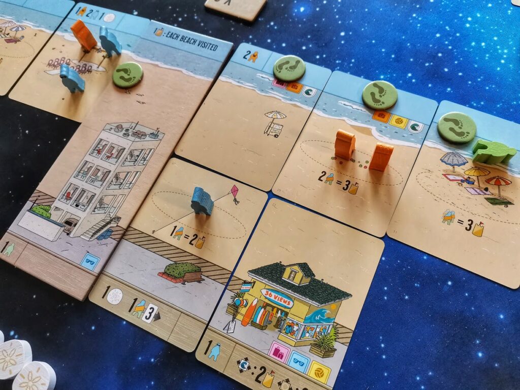
There are loads of things to consider at every single step of the game, and it’ll really get you thinking. For instance, you can only claim a card from the front row of four. The card behind it will slide down into the vacant space, making it available for your opponent on their turn. If it’s one you think will benefit them, how valuable is your card in comparison? Is it still worth taking?
Swim out past the breakers
Below the rows are cards to claim, there’s also a food truck and a foodie meeple. If you take a card where one of the two is present, you get an additional bonus, then they move along. But does that set your rival up for something even better on their next turn? Once you’ve chosen the card you want, you need to decide where to place it, and that’s not always an easy choice. Which of your scoring opportunities does it benefit the most, or does it offer up a brand new one you didn’t have before?
A relaxing seaside stroll, this is not.
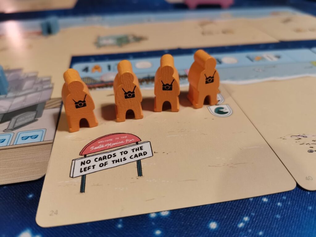
This is all made more difficult at first by the iconography. It’s not bad, but it’s not as clear as it could be in places. The symbols denoting the types of card, for example, are really small and can get obscured by meeples, and it makes it less-than-ideal for a quick visual scan of your vista to see where the chains and groups are. The icons showing how to score for adjacency too, are quite tricky to interpret on a first playthrough.
Watch the world die
Your first game of Santa Monica will definitely be a learning experience. It’s pretty obvious how to take your turns, and where the obvious scoring spots on the cards, but scoring well takes practice. One you learn how the end-game scoring works, and how valuable those goals are, it really changes the shape of the game. You’ll become much more choosy over which cards you take, and why.
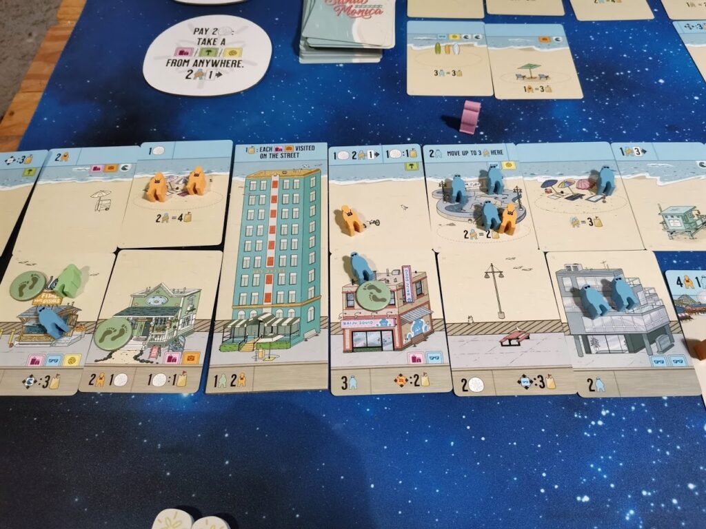
I really like this aspect of the game, as it helps it bridge that gap between the light-touch gamers in your life, and those who enjoy depth in strategy. This game is difficult to score consistently well in and I like it all the more for that. Santa Monica is a really easy game to get non-gamers to engage with too, mostly due to the laid-back artwork and styling. As a forewarning, make sure everyone has plenty of table space to spread out sideways, Santa Monica’s vistas take up quite a lot of space.
Final thoughts
Santa Monica is a really good game. It’s light and inviting enough to get non-gamers interested and playing, but under the playful exterior there’s a really clever tableau-builder waiting. You get really invested in your own little beachfront street, and more than once I’ve intentionally done myself out of a few points, just because I wanted to make my beach look a certain way. But that’s half the fun of a game like this, it’s not one that has to be too competitive. It’s really satisfying to create the kind of beach you’d like to make for yourself.
At the time of writing, you can pickup Santa Monica for around £35 in the UK, and I think that’s a fair price, but I wouldn’t pay any more than that. The screen-printed meeples and sand dollar tokens are really nice, and the card quality is great, but there’s not that much in the box. Designer Josh Wood has put together a really clever game, and it’s one I enjoy just as much each time I play it. There’s very little player interaction, save for strategic choices of which cards your do or don’t take from the display, but again, this is a nice touch for those who aren’t regular gamers. No-one likes to get sand kicked in their face.
If you’re looking for a tableau-building game a little bit different from the usual fantasy or agriculture themes, I’d highly recommend picking up Santa Monica. It fills a gap in my collection that no other does, and it’s a keeper.
(If you’re wondering about the section headings in the review, they’re lyrics from Santa Monica, by Everclear. It goes through my head every time I play the game)
Review copy kindly provided by Alderac Entertainment Group. Thoughts and opinions are my own.

Santa Monica (2020)
Designer: Josh Wood
Publisher: Alderac Entertainment Group
Art: Jeremy Nguyen, Josh Wood
Players: 2-4
Playing time: 30-45 mins
